Monday 24 February 2014

Digital Imaging Software. MOD003232. 24/02/2014

Digital Imaging Software
MOD003232
24/02/2014
9:00-12:00am


I really liked the front cover layout for this music DVD. I like the way there are 3 images separated by white lines. This would be effective for my front cover as there are many images that are of similar style however the clothes are different. On a advertising point of view this would be good because more clothes will be shown on the DVD therefore more would be advertised and in consequence sold to customers. 


Monday 17 February 2014

Digital Imaging Software. MOD003232. 17/02/2014

Digital Imaging Software
MOD003232
17/02/2014
9:00-12:00am

In today's lesson I was shown how to use different tools in Photoshop that I could use for my DVD cover. I am also going to use this lesson and some time at home analysing different DVD covers which will help me generate ideas and learn what is usually included on a DVD cover and also help me discover good and bad aspects of other DVD covers and apply this knowledge to my own cover. 

I think that this DVD cover is very well thought out and also very minimalistic and simple which is what I would like my own DVD cover to be like. This DVD cover has simple text which in white stands out very well on the dark background. I will have to take this into consideration when creating my own DVD cover because if I used a dark colour text on a dark coloured background it would not be able to be seen very well. I think on my own DVD cover it could be a large range of colours because the background is not too dark and not too light either. I really like the effect of the image fading into the dark background as it makes the image stand out well but is also blended in and doesn't look like the image has just been placed anywhere on the cover. I also like the transparency effect on the title which is behind the main title. This gives a really nice effect and makes the title stand out well but also doesn't effect the main image. This DVD cover prioritises the information on the cover because the title is the largest and most important piece of information and then the actors name is slightly smaller and then the logo's and quotes are smaller which are least important. I will be using this prioritising system on my DVD cover as I think it works well. However, the main disadvantage of this DVD cover would be that the title covers the main image, I think that having the text either at the top or bottom would have been more effective unless the title was slightly transparent so you can see the image as well as the title. 


I think that this DVD cover is very effective and there are many advantages of this DVD cover, the use of white text on a dark background is again used which is very effective for making the text stand out and more clear to read. The idea of having a one image background on the front cover is good because it is eye-catching and not too cluttered. A simple cover is more effective than too many images. Prioritising information has been used again with the title being the most important and the largest text font and then the rest of the information being less important and a smaller text font. 

The spine is quite plain  and simple with just the title of the DVD on it and a few logos, again this enforces the theme of the dark background and the lighter text font. The back cover also has only one image on it and has the same theme of colours again  creating a moody dark background for the whole DVD cover. The text on the back cover is placed very well around the image and not over it so you can see the image clearly but can also see the text aswell. Some text used is also transparent against the background image, I believe that this is also very effective because you can see the writing quite clearly and also see the background image behind it. On the majority of DVD covers the cast and other information is at the bottom of the DVD in very small writing and the DVD logos are normally at the bottom too. 

I am still looking at the idea to have my DVD cover as almost like a magazine cover, this would be a very unique look and different to most DVD covers and I think that this would grab the viewers attention. Some features of this magazine cover are the same to the DVD covers such as the colours are very carefully selected to stand out from the background in this case the background is brown and the text is white and red which stands out well on this magazine cover. I also really like the idea of having the title between the background and the actual main character on the cover. In this case the 'VOGUE' title is between the background and the model in the image. The prioritising system is also used on this magazine as well as the DVD covers. On this cover the title of the magazine is the biggest font and the model featuring the front cover has also got big font however all the other least important information is smaller. 


This is a further development to my idea, I have added a title to my DVD cover for this which I gathered from the internet and used the magic wand tool to get rid of the white background and added it to the background of my DVD. I added the original logo image to the existing background image and then I added a vector mask to this logo and made sure that the mask was selected. I then used the magic wand tool to delete the white background from the logo. I then selected the layer and moved it to where I wanted it placed on the background image. 


Monday 10 February 2014

Digital Imaging Software. Moodboard. MOD003232. 10/02/2014

Digital Imaging Software
Moodboard
MOD003232
10/02/2014
9:00-12:00am

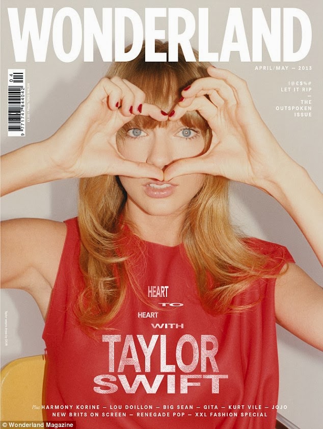
In today's lesson I was looking for ideas for my DVD cover. I came up with a few different ideas involving commercial fashion campaigns and also some commercial perfume adverts. I chose these subjects as these are quite diverse and I am very passionate about the fashion/product design world. Firstly, I came up with the fashion subject and I came up with an idea to have the DVD cover to almost mimic a magazine cover.


I started looking at this idea in detail and thought it would be a good idea because I would be able to make my own magazine front cover either by using images from the internet or doing some photography myself or using some of my previous images I have taken. I started looking further into my favourite magazines, listed below. Most magazine covers would be edited in Photoshop to cut out images and add them to the cover alongside text, barcodes, logos, artworks, layers etc.
http://www.wonderlandmagazine.com/
http://www.id-mag.com/
http://thelovemagazine.co.uk/feature/2014/issue_11_solve_sundsbo/
http://www.vmagazine.com/
http://www.russhmagazine.com/


In this magazine cover you can tell that the image has been cut out and added onto the cover of the magazine and then the text would have been added in a layer over the existing background and image. They have chosen for the background to be quite dark and then the text quite bright colours such as white and gold so that the text stands out from the background. Also they have prioritised the text so that the title of the magazine is the largest as this is the highest priority in the text.


Barcodes are always kept in the corner of magazines and don't want to necessarily draw attention to them however they have to be included for the purposes of stock control and pricing. The logo/title of the magazine is always bold and large. 


The colour choice of the magazine always ties in with the model on the front cover. The colours of red and gold are a theme on this front cover. It is quite rare to see a lot of colours going on with a front cover of a magazine. 


Again the most important information is prioritised and the colours are kept to a minimum. A digital print effect has been used on this cover to layer over the existing image and background.

I then started looking at more commercial fashion campaign advertisements for specific fashion designers in  the fashion industry such as Chloe and Prada. 


I like the idea of having  some of the same adverts but slightly different to add together. I'm thinking of having two images and change the transparency so that they merge together as a background for the DVD cover. I tried this in Photoshop by adding both images in different layers and changing the opacity of one layer until you could see both images merged together and this effect worked quite well just to give it something different and make it more unique.


For these images I had a seperate idea that the background images could go all around the DVD cover starting at the cover, going over the spine and then carrying on around to the back of the DVD. I could even add two of these sort of images together to have some different collections on the DVD. I also came up with an idea for a 3D front cover for a DVD, This effect is done in Photoshop using the 3D tool. Even though you can't see it in 3D without 3D glasses it still looks great without the 3D glasses. I am going to bring my 3D glasses in next week and try this idea out further.


With these set of images I thought these would look great on a DVD cover in a sequence or merged together. Also I had another idea which I think would look really unique and different, which is to turn all of these images into small icons of the same size and put them all together in a pattern for the background. 


This idea worked out quite well also but I think it needs breaking up just slightly as it's looking quite the same so I think maybe having some slightly more transparent than others or I could tie in the 3D idea in with this also. 


I think the 3D idea works really well and is quite edgy and fashionable and suits the fashion industry more however I don't think I would go too much into the depth of 3D otherwise the clothing will not be seen very well and really if this was an actual commercial project the fashion designer would want the product to be seen well. 


I think this one works really well, It looks modern and edgy and has a really good 3D view.
This one does not work as well as you can't really see the 3D that well maybe because this is a light colour.


Monday 3 February 2014

Digital Imaging Software. File Formats. MOD003232. 03/02/2014

Digital Imaging Software
File Formats
MOD003232
03/02/2014
9:00-12:00

In today's lesson we learnt about file formats and the advantages and disadvantages of using each type.

Bitmap Graphics

Image constructed of rows and columns of pixels, each pixel records the colour at the place in the image.
*Very large file sizes

Vector Graphics

Shapes stored as coordinates and equations.
*Compact, scaleable and resolution independent

GIF

*Only 256 colours, may lose colours when saving image.
*Provides transparency and interlace options
*Lossless compresses
*Best for graphics with large areas of continuous flat colour
*Provides animation
*Good for presenting text as an image on the web

JPEG

*Millions of colours possible
*Uses a lossy compression
*Loses info every time you save the image
*Not good for sharp edges

PNG

*Useful but not used widely
*Lossless compression
*Smaller file size than GIF
*Inherent gamma control and transparency

TIFF

*Lossless compression
*Allows transparency
*Different types of compression
*Save layers from photoshop

SVG

*2D vector graphics
*Handles animated graphics
*Uses XML with CSS text file to control behaviour
*Good level of browser support

EXR

*Lossless compression
*Multi channel images
*Raster images
*Industrial light and magic


Digital Imaging Software. Colour Theory. MOD003232. 03/02/2014

Digital Imaging Software
Colour Theory
MOD003232
03/02/2014
9:00-12:00am


In today's lecture I was learning colour theory. In the colour theory I learned some interesting information about how we see colour, primary colours, psychology of colours, web safe colours etc. 

How do we see colour?
When light hits an object, the object absorbs some of the light and reflects the rest of it. Which wavelengths are reflected or absorbed depends on the properties of the object. When you look at an object, the wavelengths of the reflected light determine what colour you see. The light waves reflect off the object and hit the light sensitive retina at the back of your eye. Cones are a type of photoreceptor, the tiny cells in the retina that respond to light. Rods are another type of photoreceptor, rods are more sensitive than cones, however they are not sensitive to colour. Rods are responsible for our dark-adapted/scotopic vision. 

Primary Colours
Primary colours are sets of colours that can be combined to create a range of different colours (Secondary colours). Red, Yellow and Blue are colours that cannot be created by combining other colours.

Red + Blue = Purple
Red + Yellow = Orange
Yellow + Blue = Green

Colour Models
-RGB (Red, Green, Blue)
This model is a cube model which shows the depth of each red, green and blue colours.
- CMYK (Cyan, Magenta, Yellow, Key)

Colour Picker
Colour picker's are good for showing web safe colours that are available and also show the hexadecimal value that you can use in HTML coding.

Psychology of Colour
Red- Passion, aggressiveness, strength, vitality.
Pink- femininity, innocence, softness, health.
Orange- fun, cheeriness, warm exuberance.
Yellow- positivity, sunshine, cowardice.
Green- tranquility, health, freshness.
Blue- authority, dignity, security, faithfulness.
Purple- sophistication, spirituality, costliness, royalty and mystery.
Brown- utility, earthiness, woodiness and subtle richness.
White- purity, truthfulness, being contemporary and refined.
Grey- somberness, authority, practicality and a corporate mentality.
Black- seriousness, distinctiveness, boldness and being classic.

*The psychology of colours should be always taken into account when creating multimedia and web content. Colours vary in meanings and emotions that a particular audience can assign to colour. When making colour decisions, it is important to determine the target audience in order to convey the right message. Colour should be carefully selected to align with the key message and emotions being conveyed. Research has also been found that females and males prefer different colours.

Web-Safe Colours
Web safe colours are those that will be displayed the same on any browser.
*There are only a small amount of web safe colours and these are better to be chosen because if an unsafe web colour is chosen the computer will automatically skip to the closest web safe colour however this may not be anywhere near the colour you chose.

Colour Wheel
-Cool Colours(Blue, Green, Violet)
-Warm Colours(Red, Orange, Yellow)
Complimentary colours are positioned opposite each other on the colour wheel if these are used together these can be intense & glaring.
*It is best not to use colours that are positioned opposite each other on the colour wheel as these can be intense and glaring but also may look very unprofessional. 

Terminology
Hue: (Colour) Red, green, pink
Saturation: The intensity of a colour.
High Saturation: Stronger, Richer colours
Low Saturation: Grey, washed out colours
Tint: White added to a colour
Shade: Black added to a colour

Colour Blindness
Normal
Protanopic- Colour blindness of red colours.
Deuteranopic- Colour blindness of green colours.
Tritanopic- Colour blindness of yellow colours.
*It is wise to choose colours that all people will be able to view and is accessible for everyone. Therefore maybe having a black line around text if it is coloured so then colour blind people would be able to see the text or another way of making a website more accessible for colour blind people would be to include alt-text to label images etc. Also using reds and greens together may not be a great option as reds and greens are often indistinguishable.