Moodboard
MOD003232
10/02/2014
9:00-12:00am
In today's lesson I was looking for ideas for my DVD cover. I came up with a few different ideas involving commercial fashion campaigns and also some commercial perfume adverts. I chose these subjects as these are quite diverse and I am very passionate about the fashion/product design world. Firstly, I came up with the fashion subject and I came up with an idea to have the DVD cover to almost mimic a magazine cover.
http://www.wonderlandmagazine.com/
http://www.id-mag.com/
http://thelovemagazine.co.uk/feature/2014/issue_11_solve_sundsbo/
http://www.vmagazine.com/
http://www.russhmagazine.com/

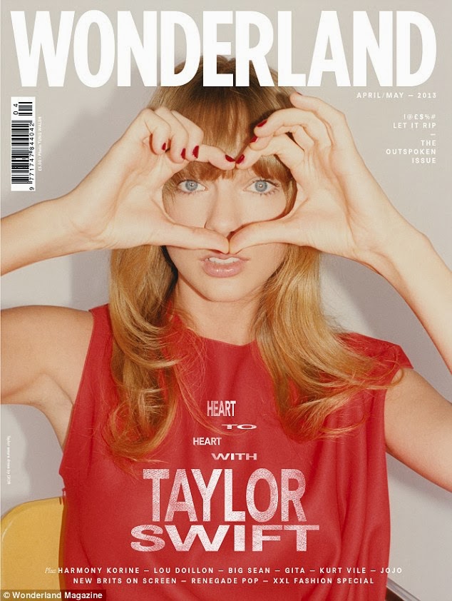
In this magazine cover you can tell that the image has been cut out and added onto the cover of the magazine and then the text would have been added in a layer over the existing background and image. They have chosen for the background to be quite dark and then the text quite bright colours such as white and gold so that the text stands out from the background. Also they have prioritised the text so that the title of the magazine is the largest as this is the highest priority in the text.

Barcodes are always kept in the corner of magazines and don't want to necessarily draw attention to them however they have to be included for the purposes of stock control and pricing. The logo/title of the magazine is always bold and large.


The colour choice of the magazine always ties in with the model on the front cover. The colours of red and gold are a theme on this front cover. It is quite rare to see a lot of colours going on with a front cover of a magazine.

Again the most important information is prioritised and the colours are kept to a minimum. A digital print effect has been used on this cover to layer over the existing image and background.
I then started looking at more commercial fashion campaign advertisements for specific fashion designers in the fashion industry such as Chloe and Prada.


I like the idea of having some of the same adverts but slightly different to add together. I'm thinking of having two images and change the transparency so that they merge together as a background for the DVD cover. I tried this in Photoshop by adding both images in different layers and changing the opacity of one layer until you could see both images merged together and this effect worked quite well just to give it something different and make it more unique.


For these images I had a seperate idea that the background images could go all around the DVD cover starting at the cover, going over the spine and then carrying on around to the back of the DVD. I could even add two of these sort of images together to have some different collections on the DVD. I also came up with an idea for a 3D front cover for a DVD, This effect is done in Photoshop using the 3D tool. Even though you can't see it in 3D without 3D glasses it still looks great without the 3D glasses. I am going to bring my 3D glasses in next week and try this idea out further.


With these set of images I thought these would look great on a DVD cover in a sequence or merged together. Also I had another idea which I think would look really unique and different, which is to turn all of these images into small icons of the same size and put them all together in a pattern for the background.


I think this one works really well, It looks modern and edgy and has a really good 3D view.

This one does not work as well as you can't really see the 3D that well maybe because this is a light colour.
No comments:
Post a Comment